The CSS Display Property Explained
While CSS is the core styling language for powering the world wide web along with HTML and JavaScript, it is often getting least attention especially by beginner frontend developers putting their main focus on quickly learning frontend JavaScript frameworks like React or Vue. After diving deep into core features of CSS you'll recognize what CSS is really capable of!
Everything is a box
Remember how everything is a box on the web? Here is a quick refresher!
- Browsers render each element from the element tree as a box.
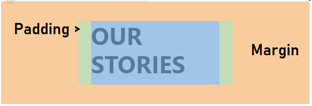
- Each box has a margin, a border and a padding precisely defining its dimensions

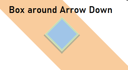
The image above shows part of a website I recently built, where different shapes are included. Using the browser's developer tools you can easily display the boxes around each rendered element.

Especially the blue arrows pointing down are interesting. You may be surprised to see that - despite their triangular shape - these arrows are still rendered as a rectangular box in the browser!

As you can see the box has two solid borders and is rotated by 45 degrees in order to let the arrow point down. But it is still a box!
CSS Flow Layout
In order to define the page's layout each box is put into the normal flow depending on their display values. The most basic values for the CSS display property are
display: blockdisplay: inlinedisplay: none
An element set to
display: noneis completely removed from the normal flow, so its not appearing in the element tree, unlikevisibility: hidden
Here, we want to focus on display: block and display: inline to give you some basic knowledge of how to use these properties to your liking.
Many HTML elements are inline or block by default
Every time we use a <div> element, we actually use a block-level element. Ooooops, I am glad you already knew that! 😄
Here's a list of most frequently used HTML elements and their default display property values.
block |
inline |
|---|---|
<div> |
<a> |
<p> |
<span> |
<ul> |
<img> |
<ol> |
<button> |
<li> |
<input> |
<nav> |
<textarea> |
<header> |
<select> |
<footer> |
<i> |
<pre> |
<code> |
<hr> |
<br> |
Block vs Inline elements
Basic differences of block and inline elements influence how they integrate into the flow layout. Being aware of these facts help to understand positioning elements on a website and may be useful when debugging 😉
Block-level element behavior
- Always start on a new line
- Take 100% width (of the parent element) by default
- Can be applied
widthandheightwith CSS - Can have
blockand/orinlinechild elements
Inline element behavior
- Do not start on a new line
- Sibling inline elements appear next to each other
- Take only as much space as needed
- Can only contain other
inlineelements
CSS display working example
Imagine you have some paragraph with text including several anchors in order to link the user to other pages. You want to fire a CSS animation on hover, to let the user know that's a clickable link.
This Article by Danny Guo covers the topic of underlining multiline text with CSS quite nicely and very in-depth!
Here is a quick visual example of our aimed solution.

So, in order to make an underline animation with CSS, we can basically set a background-image on the element with linear-gradient which generates an image for the background. Initially, the background-size is set to the full height (100%), but to zero width (0%). Then a transition is set on the original element animating its background-size when that property will be changed on hover.
#with-underline {
  background-image: linear-gradient(
    transparent calc(100% - 15px),
    rgba(36, 153, 209, 0.5)
  );
  background-size: 0% 100%;
  background-repeat: no-repeat;
  transition: background-size 0.35s cubic-bezier(0.42, 0, 0.58, 1) 0.1s;
}

#with-underline:hover,
#with-underline:focus {
  background-size: 100% 100%;
}
On hover the elements background-size increases its width to 100% using the specified cubic-bezier timing function. More on predefined timing functions can be found here
It's best practice to apply similar or the same visual effect on focused elements for users how navigate your site through the keyboard or with screen readers. So make sure to include
:focusnext to the:hoverpseudo-class selector!
What may happen if you are not aware of display block and inline behavior?

When applying the CSS above to a block element, i. e. #with-underline being a <div> or <p>, the multiline underline animation fails 😡
The background-image is at the bottom of the whole block, and not multiline like intended.
Simply adding display: inline to the respective element (or changing it to an inline HTML element by default like <span> or <a>) gives us the wanted solution of a multiline underline animation on hover! 🎉

Conclusion
CSS is a powerful language being constantly improved by W3C and is one of the foundational languages for the web next to HTML and JavaScript. Knowing the basics about the CSS display property, HTML elements and their default display values and how it affect the integration of said HTML elements into the CSS Flow Layout helps with positioning elements on a website. It can be a huge time saver when it comes to debugging!
This introduction to CSS display and its most frequently used values block and inline may broaden your background knowledge of CSS and help setting up layouts with HTML and CSS! 🔥
